VALDES ARTS 345: Textbook Chapter 4 and X-Fest Logo and Poster
- Emma Laing

- Nov 1, 2024
- 2 min read

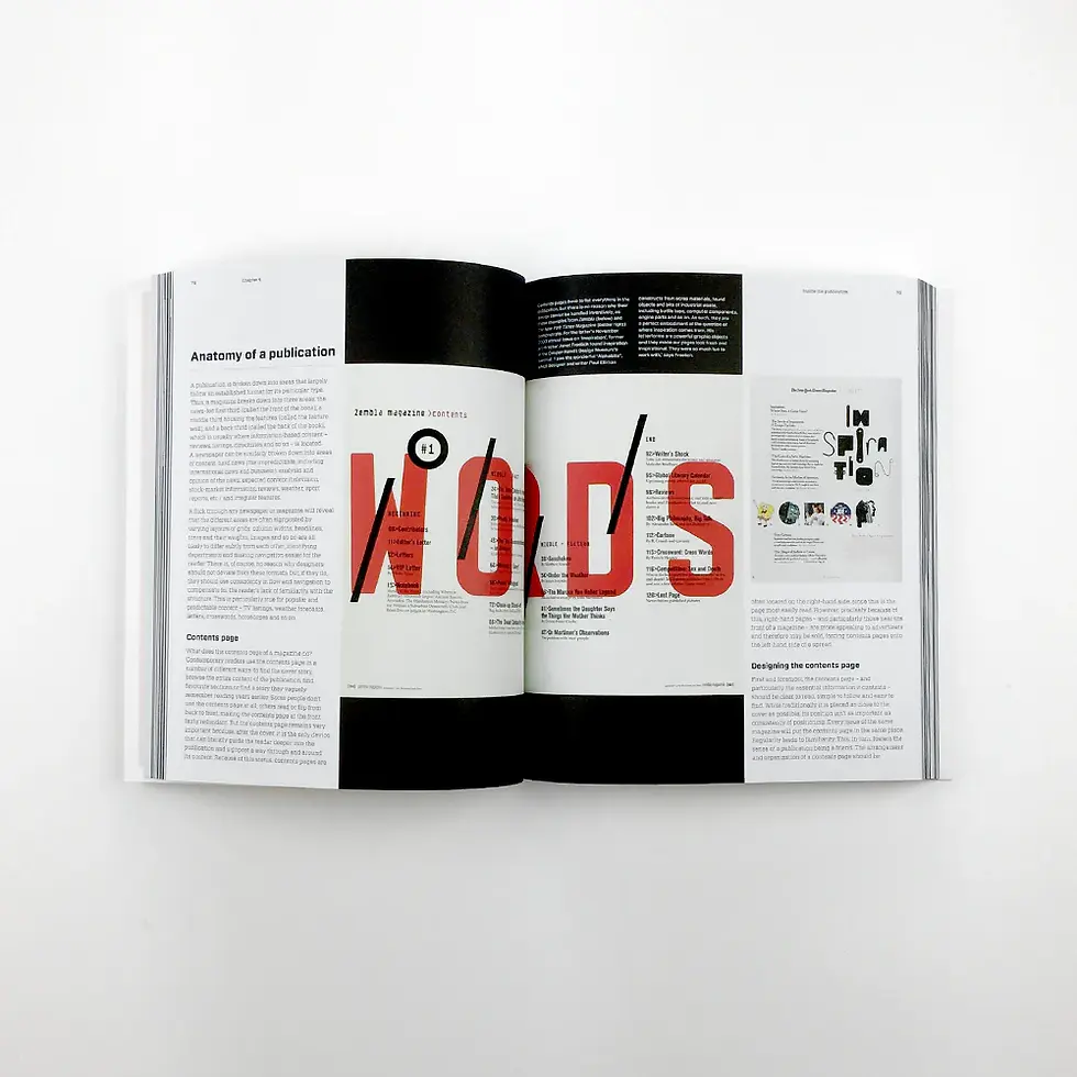
This week's textbook chapter covered the ins and outs of editorial design, the ability to understand the publication, what the elements of one are, and how to apply those when creating something like a magazine or newspaper. A lot of what was described in this chapter had to deal with the different parts that make up the initial design that set it apart from traditional design. The text breaks down the anatomy of magazines into three areas: the news led first third (front of the book), the middle third housing features (called the feature well), and the back third (called the back of the book). It breaks down newspapers similarly into categories such as the hard news(the unpredictable, including international news and business), analysis and opinion of the news; expected content (television, stock market, reviews, weather, sports, and irregular features. What I found to be particularly useful was the section that discussed the role of typography in editorials and how to understand the different language used specifically when talking about type in the editorial context, such as body copy, tag-lines, stand-firsts, pull quotes, and bylines that are all super important to know when talking about editorial design. I enjoyed this chapter and think that it will be very applicable not only to our next project and the current project but also because I would like to work in editorial design in my future career. I have very limited experience in this type of design other than creating my process book last semester, but I enjoyed it and am excited to delve more into it.

This week was a bit of a struggle for me in many ways, working on moving from a finished logo for my X Fest branding to then starting to create my poster, billboard, print ad, and book cover I felt a little overwhelmed and creatively stuck on this project as I was having a hard time finding the right direction I wanted to take this project that would fit within the superhero comic theme but also somewhat reflect my own personal style and be something I liked as well. At the end of the day, I started solidifying a sci-fi sort of vibe for my brand that fits well with the logo, and after finding some images I wanted to use, I feel that I have a better direction. So far, I have only completed my poster, but I plan on taking a very similar approach to all of my assets for this campaign.


Comments